Logo design for ZENERGIE





Category
Logo DesignProject Overview
Zenergie is a wellness company that provides advice, podcasts, and videos to help people manage stress, anxiety, and other mental health issues. They wanted a logo that would reflect their company’s focus on balance, harmony, and well-being.
Design Process
I started by brainstorming ideas for a logo that would incorporate the yin yang symbol. I wanted to create a logo that was both visually appealing and meaningful. I also wanted to make sure that the logo would be relevant to Zenergie’s target audience.
After brainstorming, I created several sketches of different logo designs. I then presented these sketches to Zenergie and they chose one that they liked. I then refined the logo design and added the text “Zenergie”.
Final Product
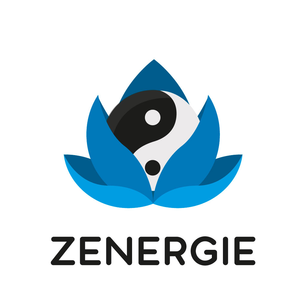
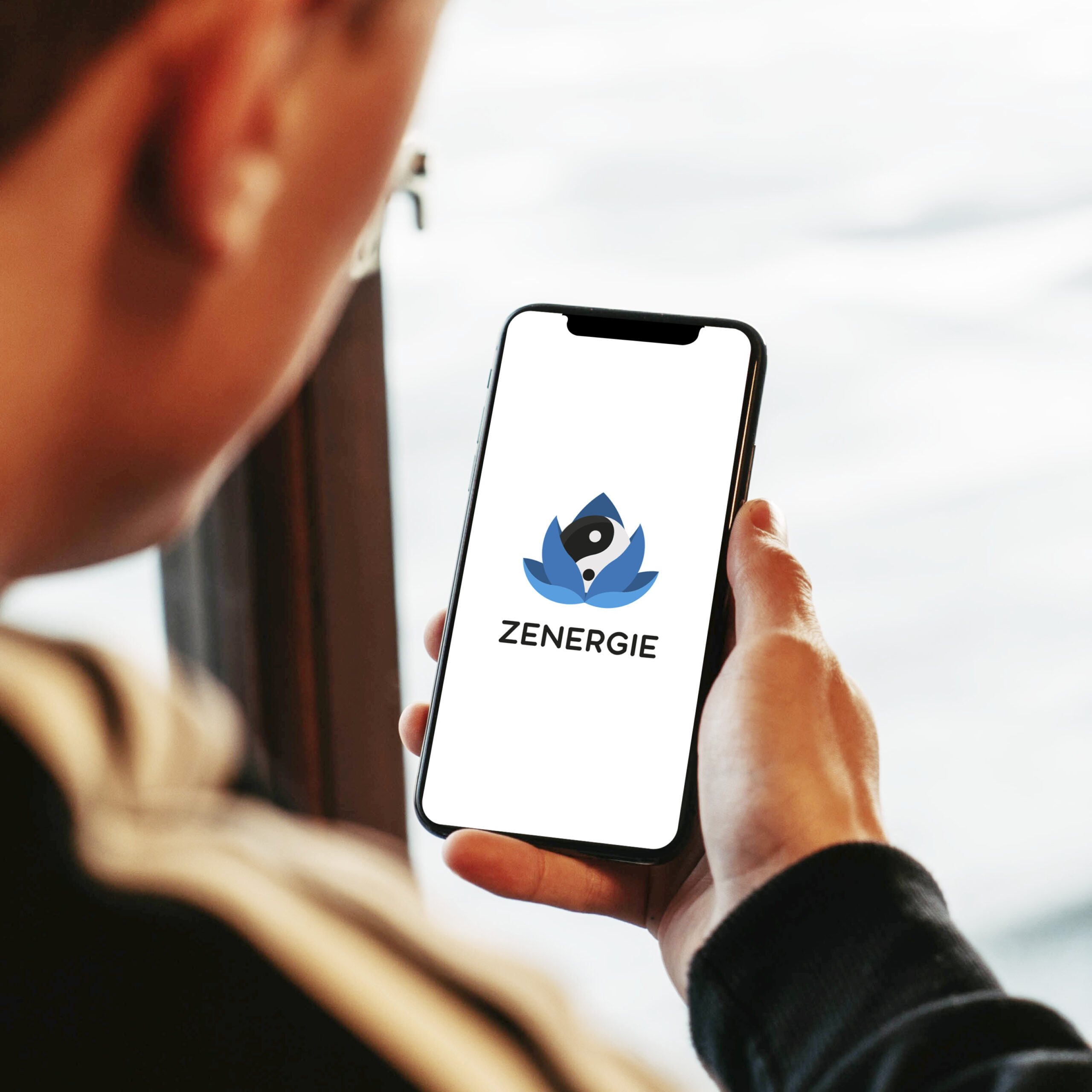
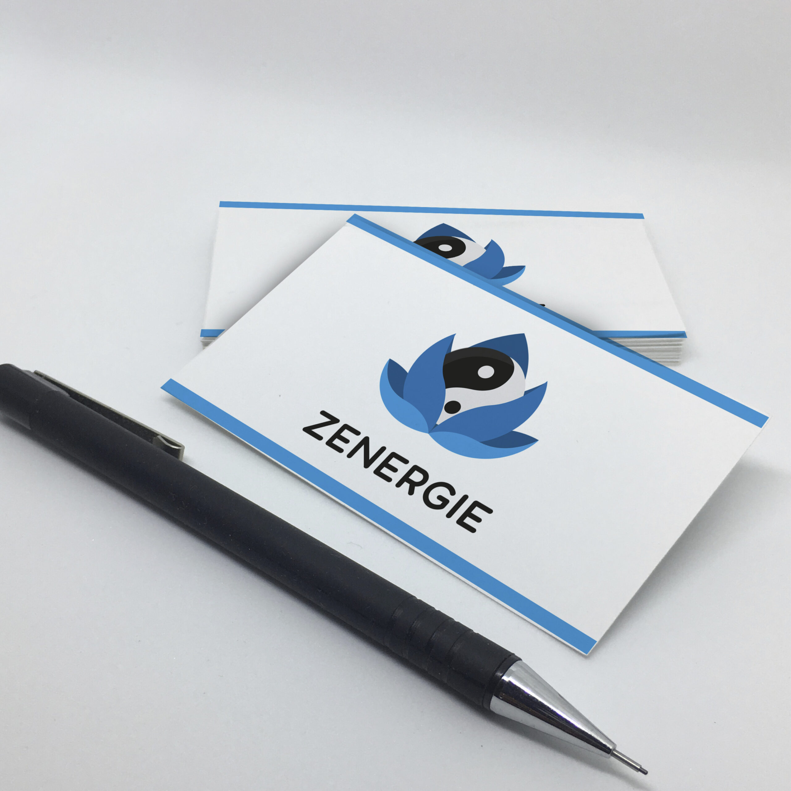
The final logo is a yin yang symbol that is surrounded by blue leaves. The yin yang symbol represents balance and harmony, which are two of Zenergie’s core values. The blue leaves represent nature and well-being. The text “Zenergie” is displayed in black letters above the symbol.
Results
Zenergie was very happy with the final logo design. They felt that the logo accurately reflected their company’s values and that it would be effective in communicating their brand to their target audience.
Conclusion
I was very pleased with the results of this project. I was able to create a logo that was both visually appealing and meaningful. I also believe that the logo will be effective in communicating Zenergie’s brand to their target audience.
Key Takeaways
- The key to designing a successful logo is to understand the company’s values and target audience.
- The logo should be visually appealing and easy to remember.
- The logo should be relevant to the company’s industry.
Additional Information
The logo was designed to be used in a variety of contexts, including on the company’s website, social media, and marketing materials. The logo is also scalable, so it can be used on both small and large formats.
The logo was well-received by Zenergie’s target audience. The company received positive feedback on the logo’s design and its ability to communicate the company’s values.
I am confident that the logo will be an effective tool for Zenergie in communicating their brand to their target audience.


